Dramaturg Zev Valancy checked in with scenic designer Joanna Iwanicka about her work for our production of Anna Karenina.
ZV: Anna Karenina is a story from a very different era, which nonetheless has real resonances with contemporary society. What about the story (and people working on this adaptation) made you want to design the set?
JI: When I was offered me the position of set designer for Anna Karenina, I was beyond thrilled. I have collaborated with Lifeline Theatre since 2006, and have worked with Amanda and Jessica before, too (most recently on a KidSeries show: Sparky!). Seeing Stephanie Diaz’s process up close and personal was also a bonus I was excited to accept. From my experience, Lifeline projects have always been intellectually ambitious and artistically rewarding, so I was sure to accept the job with the proper ratio of excitement and humility. When saying YES to Anna, I had not yet read the Russian classic, though I have been a fan of Russian literature for decades. As soon as I listened to an audio-book version of the novel, I fell in love with the characters and how fully rendered and grounded they were. I got excited that Anna’s story was paralleled with Levin’s and that the story, as life itself, goes on regardless of tragedies and downfalls of the individuals in it.
ZV: Were there any themes or emotions that stood out as you worjed out the aesthetic of the set? Any artists who inspired you?
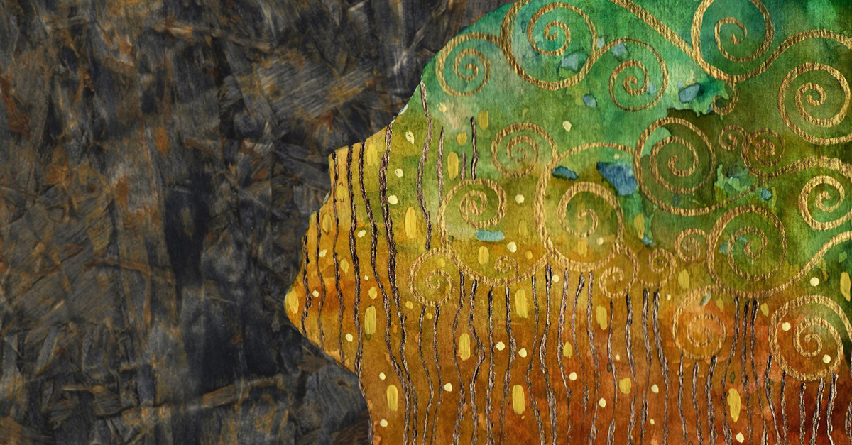
JI: I think that the major theme of this production is the universality and timelessness of the story. Producing a play about Russian aristocracy of generations past in 2018 America called upon picking an aesthetic that would bring it up to date or at least break away from a traditional period-specific interpretation. The key influence was the art of Gustav Klimt, who was brought to the design team by the director. That choice provided to be potent enough to transcend not only the artwork used in our backdrops, but also the choice of materials used on the set. By juxtaposing the lush elegance of Klimt’s art with rough and industrial metal elements of the set, I hoped to infuse the production with the tensions of the zeitgeist contemporary to Tolstoy’s characters as well as modern day America.
ZV: The space at Lifeline has a very distinctive size and shape. What challenges and opportunities does that offer, and does this production differ from previous times you have designed for Lifeline?
JI: It’s important to note that all spaces provide their unique challenges and to me design is an art of harnessing those and making the play work within the limits of the given space. What I absolutely adore about this space is the height, allowing for creation of multiple-level sets. That also means the audience members can have quite different points of view of the play depending on their seats in the house. This particular production has also brought us a specific requirement of puppet movement, which inspired the choice of raised deck and a “trench” running across the stage. In my previous endeavors in this space, I have often tried to embrace the color palette of the existing brick and to create sets that blended in well within this “container”. Anna’s set is breaking away with this trend. This time I decided to be much more restrained with my color palette, and bank on accent colors to help us tell the story.
ZV: There are many locations in this story, and it isn’t possible to represent them all realistically. How did you make decisions about how to represent them all within the limitations of space and budget?
JI: My main focus was to create a structure which would allow the characters to leave, travel, and arrive at their destinations without covering much distance, hence not extending the duration of the transitions. Amanda and I also quickly realized how important it would be to have scenes melt, blend, and co-exist onstage, which called for the playing areas to be that much more partitioned and fragmented. Giving up on realistic furniture was an easy choice to make, both logistically and conceptually. I wanted the main staircase to be tightly related to Anna’s arc of the story and with that it seemed obvious that it would function not only as the train staircase, but also her carriage, bed, and deathbed. With that in mind, it only made sense to put other existing objects to “work” and re-imagine other stair units as sittables, or to create acting cubes in the balconies that can serve us as any furniture that we need up there.
ZV: This set has to do a lot of work, both in terms of fluidly representing dozens of locations and bolstering a story with complex characters and themes. What principles guided you towards artistic solutions to these challenges?
JI: As I am writing these words we are about to enter the phase of our process where a lot of the choices will be made more specific and become reality. So far, I have paid attention to keeping the set unified with a tight color palette in order to allow for the other important elements of the production to shine and telegraph their specific meaning to the story. The question we have been asking each other throughout hours poring over sketches and plans of the set was how to minimize the number of objects while maximizing their impact. As a rule, I try to stay away from adding purely decorative elements and focus on streamlining the storytelling through shapes and colors that pop against monochromatic background this set provides.

